TV Flashback: Moondial (1988)

Ah, piracy. There are so many ways in which it’s a measurably bad thing, something we’d undoubtedly be better off without – but one thing that the world of copyright infringement is annoyingly good at is catching the things that fall through the cracks. Not everything stays in print, or easily available, and it’s amazing what you can track down if you’re prepared to look. I’d never have gotten another look at the wonderful, wonderful James Burke documentary series ‘The Day the Universe Changed’ if it wasn’t for piracy – and I also wouldn’t have gotten another chance to watch the fantastically atmospheric and spooky BBC childrens drama serial, Moondial.

Broadcast back in 1988, Moondial got a VHS release sometime in the early Nineties, but ever since then it’s almost entirely vanished from view – it’s ridiculously difficult to get hold of, and the one ‘proper’ DVD release it got vanished from the shops almost as soon as it was released (the most recent DVD release was – weirdly – via the Reader’s Digest, and is also now unavailable – it’s this full episodic version that is, at least at the moment, up in full episodic format on Youtube. And just to be clear, I’d buy a commercial DVD release of it in an instant, as would plenty of other similarly aged TV SF/fantasy geeks, I’m sure). Of course, there’s an awful lot of stuff from that era that doesn’t get a release as well, but it’s frustrating in Moondial’s case because it stuck in my memory so strongly from when I first watched it, back when I was fourteen, and the world of Children’s TV was a much weirder, spookier place.

There’s a whole variety of shows that are burnt into my mind from that era – one of them, the ITV anthology series ‘Dramarama: Spooky’, scared the living crap out of me so much that I’ve actually avoided the recent DVD release, simply because I’m not sure I want to find out that my memory cheated and that it wasn’t quite as scary as I’ve remembered. Some haven’t aged brilliantly – The Box of Delights, for example, a much-praised 1984 adaptation that kicked off a whole run of prestigious fantasy adaptations, still has charm but doesn’t quite hold together (mainly because of the completely insane free-form nature of John Masefield’s original story), but while Moondial is absolutely a product of its time and often spectacularly Eighties, it’s also aged better than I expected and pulls off some impressive levels of atmosphere.

Adapted by children’s writer Helen Cresswell from her own novel, it’s the story of Araminta Caine (teen actress Siri Neal), usually known as Minty, who’s packed off to stay in the country with her slightly stand-offish aunt, but barely gets a chance to settle in before her mother is involved in a near-fatal car-crash that puts her into a coma. Traumatised and lonely (especially since her father already died a few years previously), Minty ends up exploring the grounds of the sprawling country house nearby (actually Belton House in Lincolnshire), but soon finds herself involved in the kinds of spooky goings-on that tend to happen around mysterious country houses in children’s stories. In this case, an ancient sundial holds the key to something that’s halfway between a time travel tale and a ghost story, as Minty crosses paths with an ailing kitchen boy called Tom, and a terrified girl who always hides her face – both of them trapped in their respective worlds, and both needing Minty to eventually find their freedom.

Safe to say, this isn’t exactly action-packed. We do get two definite villains – an evil governess, and a hilariously nasty goth ghost-hunter, both played by Jacqueline Pearce in full-on style that’ll bring back happy memories of her days as ferociously camp villainess Servalan in BBC cult space opera Blake’s 7 – but this is in no way an adventure story. Mood is the key word here, and there’s a certain level of weird abstractness to the story that you certainly couldn’t get away with today, but while Moondial is mainly a gently-paced, slow-burning mood piece that’s all about character, it’s often an astonishingly good one.

The late Eighties is a time when the whole look of television started to change and evolve at a pretty dizzying rate, and there are a certain aspects of Moondial that feel very entrenched in the way things used to be – for example, the number of beautifully plummy English accents on display, especially in the adult members of the cast. However, visually there’s a very definite effort to make this look good – fantasy TV is always very director dependant, and it’s pretty clear that the director here (Colin Cant, who only worked on a handful of projects after this according to IMDB) understood that the visuals and the location was going to have to do a lot of the heavy lifting in terms of generating a sense of enigma and mystery.

The end result of this is that the whole show has a wonderfully spooky edge, one that’s helped by the emotional undercurrent at the heart of the story – that it’s essentially about a girl finding a way of dealing with the possibility that her mother might die. We get a whole selection of sweeping tracking shots and kooky wide-angle lenses, which gives the show a very definite sense of style, and it’s also one of the few examples I can think of where filming day-for-night – throwing special filters onto the camera to acheive the illusion of night, back when cameras weren’t as powerful and night shooting was pricey – actually works. This is thanks to some carefully used filters and video effects, as well as the decision to drain most of the colour out of the image – what you get is something that doesn’t exactly look like night, but it does look dusky, weird and definitively spooky.

What makes it even more surprising is that Moondial is shot on video, and it’s incredibly difficult to make something shot on video look stylish (for an object lesson, go look at the late Nineties Neil Gaiman-written BBC drama Neverwhere, which only occasionally manages to lose the shot-on-video curse). Even the contemporary episodes of Doctor Who shot at the time (Season 25) don’t pull off quite so many moments of pure cinematic style as Moondial does when it’s really working. Matching this is a music soundtrack by David Ferguson that uses a mix of synths and traditional instruments in a way that’s weirdly timeless, adding a major level of darkness and edge to something that really could have come across as whimsical and feather-light.

There’s also the deliberately sinister edge given to the transport through time – I’ve always been fond of shows and movies that try to depict the impossible as real, and Moondial presents its fantasy elements very carefully, in a stylised but very controlled way. The travel through time via the sundial/moondial is acheived really simply – a circling tracking shot that spins around the sundial in question, combined with a funky piece of spinning late 1980s video effects – but combined with some fantastically eerie sound design, it gives a real sense of process. Rather than trying to be magical and charming, time travel in Moondial is weird, unsettling and disorienting, and the whole story feels much more weird (and ever-so-slightly science-fictional) as a result.

Admittedly, while much of Moondial still works astonishingly well, not everything here has aged as effectively. For a start, there’s an earnestness to the story that’s often touching, but occasionally trips over into slightly clumsy storytelling – it’s a very internal story, and unfortunately ends up relying on the ‘central character talks to herself’ device a few too many times. Siri Neal is often very impressive in a demanding role (she’s in virtually every scene), especially the sequences between her and Tom (Tony Sands), but there’s a few awkward moments in the opening episodes – especially a bit of full-on hysteria in episode 1 when she finds out about her mother’s accident – that don’t quite come off. The adult actors are generally divided into those who are really effective, and those who are giving slightly mannered ‘childrens TV’ performances (although Pearce isn’t among these, and gives a wonderful villainess turn that’s cool, chilling and distinctly camp).

The pacing is a bit too slow at times, even by Eighties childrens series standards – it’s a show that works better in 25 minute chunks than taken all in one go, and there does come a point in episode 6 where it’s hard not to think “Oh dear god, not another slow walk along the terrace to the Moondial?” Plus, the style is often very Eighties, even though there are plenty of TV dramas from that era that have aged much, much worse (like a 1986 version of Jane Austen’s Northanger Abbey, which now bears an unfortunate resemblence to the music video to ‘Total Eclipse of the Heart’).

Ultimately, the thing that’s most effective about Moondial is its sheer weirdness, which is what makes it even sadder that there’s hardly anything like it on television anymore. It taps into a very English form of spookiness (from the menace of country houses, to the devilish children dressed in Wicker Man-style animal masks), it’s as gothic (and Goth) as a childrens TV series can probably get away with, and it’s a show that dares to take its time and be deliberately dreamy and surreal. While it’s rough around the edges, and the ending will almost certainly leave you scratching your head and going “Okay, that wasn’t entirely satisfying…”, this is still a trip down memory lane that’s worth taking. Here’s hoping that a proper DVD re-release turns up sooner rather than later…

Movie Review: Immortals (2011)

Cast: Henry Cavill, Mickey Rourke, Stephen Dorff, Freida Pinto, Luke Evans ~ Writers: Charley Parlapanides, Vlas Parlapanides ~ Director: Tarsem Singh

Immortals Movie Poster Henry Cavill Tarsem Singh 2011[xrr rating=3/5]

Reviewer: Saxon Bullock (aka @saxonb)

The Low-Down: A ridiculously stylised and deeply demented flipside to last year’s Clash of the Titans, Immortals is a barmy mix of mythology, action and borderline insane costume design that packs in some unexpected pleasures for those willing to go along with such a seriously kooky approach.

What’s it About?: Thousands of years ago in ancient Greece, a conflict took place between two warring groups of immortal beings. The defeated, named the Titans, were imprisoned beneath Mount Tartarus, while the victors, naming themselves ‘Gods’, now rule over the world but are forbidden to interfere in the fate of mankind. However, the Heraclian king Hyperion (Rourke) is on a vengeful quest to bring down the Gods, and the only man able to stop him may be humble peasant Theseus (Cavill)…

The Story: (A brief note – Immortals was shot in native 3-D, but as I’ve recently been having major problems watching 3-D movies (and prefer not to get headaches and eye-strain at the cinema), the 2-D version is the one under review.)

For someone who’s only notched up three directorial credits so far, Tarsem Singh is ending up as a seriously divisive filmmaker. Right from his movie debut, the 2000 serial killer thriller The Cell, he’s showcased a deliberately sumptuous, lush and in-your-face approach to visuals, costume design and filmmaking technique that there’s absolutely no middle ground on – you either get swept along by his almost theatrical approach to visualising fantastic sequences on film, or you find his whole ethos deeply annoying and ludicrous in the extreme. Now, eleven years later (and with his only other movie inbetween being the quirkily weird and beautiful low-budget drama The Fall, which Singh mostly self-financed with his lucrative work in the commercials sector), he’s made a return to big budget filmmaking, and there’s absolutely no sign of him backing away from his idiosyncratic visual stylings – in fact, Immortals takes the lush insanity of the fantasy sequences in The Cell and The Fall and pushes it even further than before.

Immortals 2011 Tarsem Singh Henry Cavill MinotaurThe result is a mythological actioner that basically functions as a style-over-substance fever dream, a lush and barmy journey into a world where normal rules of cinematic reality don’t apply. Anyone going into Immortals expecting a 300-style tale of throbbing manliness is largely going to be disappointed – while Henry Cavill looks admirably heroic with his shirt off and there are a selection of very well-realised traditional combat sequences, the limb-lopping, bone-crunching violence is more influenced by Park Chan-Wook’s Oldboy than Snyder’s testosterone-soaked opus. Added to which, with its approach to mythology, Immortals frequently plays like a creature-free, gory version of a 1960s Ray Harryhausen adventure, tackling its story of gods and men with an admirably po-faced level of seriousness. Indeed, it’s hard to think of a fantasy actioner that’s been this deliberately portentious and stony-faced since John Milius’s Nietzche-influenced take on Conan the Barbarian, and the melange of accents and acting styles, along with the truly bizarre approach to costumes and visuals (with the strongest visual reference being 16th Century painter Caravaggio), all gives the film a wonderfully rich and exotic sense of mythic oddness.

This bizarre blend also includes the approach to the story, and while Singh has an amazing eye for visuals, with Immortals embracing even more than 300 the idea of making greenscreen movies deliberately artificial, the story doesn’t always hang together. Weirdly enough, at various points the movie is both a remix of Greek myth and a ‘realistic interpretation’ – we get intertitles informing us of specific dates and locations, and Theseus’s showdown with the bull-helmeted ‘Beast’ soldier is obviously meant to be the beginning of the legend of the Minotaur, and yet the film also plays the mythology as completely real. This is absolutely a film that’s at least attempting to tackle what it means when Gods mess about with human lives, but it’s only fitfully successful in doing this, while also showing a weird habit of building up strong conflicts only to either abandon or forget about them.

Freida Pinto Immortals Tarsem Singh 2011Lysander (Joseph Morgan), the traitorous soldier who sells out Theseus’s village (and is also the victim of one of the more memorable and eye-watering moments of baroque violence) is built up throughout as a relatively important character, only to be abruptly dispatched with little ceremony in the climax, while oracle Phaedra (Slumdog Millionaire’s Freida Pinto) is given a potentially major problem – she’ll lose her powers of prophecy if she loses her virginity – but then hops into bed with Theseus halfway through the story and spends the rest of the film as window dressing. The story of Theseus really boils down to a fairly predictable hero’s journey, as he’s maneuvered into place by fate, destiny and the actions of the Gods, and the film never quite comes to grips with one of the biggest features and problems of Greek myths – keeping dramatic tension going when, at any moment, powerful deities can turn up and deliver stunningly realised ultraviolence at the drop of a hat.

Immortals 2011 Tarsem Singh Zeus and the GodsOf course, in a film that features more than its fair share of exotic, eccentric and downright insane costume choices (particularly Hyperion’s natty giant lobster-claw hat), the weirdest and probably most divisive choices are kept for the Gods themselves. Presented as fey, ludicrously beautiful fashion models swanning around Mount Olympus in massive gold cloaks and headgear that boggles the mind (especially Apollo and his spiked-mohican helmet), they’re a gigantic distance from the usual portrayal of Greek gods – and yet, it’s almost as if they’re a deliberate litmus test, that Singh is pushing his love of operatic theatricality as far as it will go and challenging the audience to keep up, making the Gods seem exotic, weird and oddly inhuman in a way that doesn’t involve using CG (a device he only really uses to transform landscapes and create insanely over-the-top violence). It’s a stylistic choice that manages to be utterly ridiculous and yet weirdly effective and powerful at the same time, especially in the final battle, where the Gods are finally pitched against the bestial, dog-like Titans, and suddenly those perfect bodies are being subjected to all kinds of blood-soaked gory violence.

Immortals isn’t a film to look to for a traditional, expected version of Greek mythology, and what it tries to say is somewhat muddled by Singh’s sheer determination to make everything subservient to the wonderfully weird visual atmosphere he’s building. The performances vary wildly, with Rourke and Cavill feeling like they’re in different films, although Cavil does acquit himself well – aside from a woeful rousing pre-battle speech – and shows enough screen presence to make him an intriguing choice for the upcoming new Superman film. Rourke’s natural sense of mumbling menace is occasionally effective, although it’s hard not to think Hyperion would have been an even more effective villain with half as many scenes, and his climactic fight with Theseus seems to go on for at least five minutes too long before his absurdly protracted death.

Immortals Henry Cavill Tarsem Singh 2011But ultimately, this isn’t an actor’s film – it’s a fantasy romp and a visual feast that’s so deliberately off-the-wall that for some, the emphasis on surreally theatrical eye candy is either going to be too much or boring in the extreme. Once again, there’s no middle ground on Singh’s sword-and-sandals epic, and yet while 300 is undoubtedly more focussed and direct, Immortals is weirder, more textured, less grotesquely right-wing, and ultimately a hell of a lot more interesting. Tarsem Singh may have a genuinely great film in him somewhere (although, from the looks of the recently released trailer, it certainly isn’t his next project, the dreadful-looking fairy tale comedy Mirror, Mirror), or he may be destined to remain a filmmaker who dazzles the eyes while never quite mastering the art of balancing the style with substance. However, for the moment, he’s made a fantasy action adventure that’s nuttier and more visually bizarre than anything else on the market, and with most Hollywood blockbusters going out of their way to be as bland and homogenous as possible, that’s at least something to be applauded.

The Verdict: The best example of visual style balancing out muddy storytelling since Tron: Legacy, Immortals is undoubtedly a brutal, eccentric and frequently ridiculous movie – and yet, there’s something about its single-minded determination to deliver visual weirdness that’s ultimately quite beguilling. A mess, but a visually stunning and weirdly compelling mess all the same.

Comics Review: The DC New 52, Week 4 – Batman, Birds of Prey, Blue Beetle, Captain Atom, Catwoman, DC Universe Presents, Green Lantern Corps, Legion of Superheroes, Nightwing, Red Hood and the Outlaws, Supergirl, Wonder Woman

Reviewer: Saxon Bullock (aka @saxonb)

Batman 1 cover art Greg Capullo DC New 52BATMAN issue 1
Writer:
  Scott Snyder ~ Artists: Greg Capullo and Jonathan Glapion ~ Price: $2.99 ~

[xrr rating=5/5]

Scott Snyder is turning into one of the major stars of the relaunch – he’s been assigned to two of the highest profile titles, and after the success of Swamp Thing, he’s scored another slam dunk here. Considered as the more ‘superhero’ aimed Batman title (in contrast to the grittier-slanted Detective Comics), Batman issue 1 is a cracking piece of comics storytelling that does everything you’d want from a first issue, bringing the reader up to date with the current status quo while also throwing in some fantastic narrative curveballs. With plenty of ideas on show and a likeable, engaging storytelling style, Snyder has this under control from page 1, utilising exactly the right level of atmosphere, delivering some great dialogue and building everything up to an effective cliffhanger. On top of this, there’s Greg Capullo’s art (with Jonathan Glapion on inks) which pulls of a nice mix of cartoonishness and atmosphere that avoids too many current superhero visual cliches, giving us some great moments (including the gorgeous Batcave double-splash page). Packing in plenty of value, this sets the flagship Batman title off at a brisk run, and looks to be one of the strongest comics in the New DC 52 line up.

Birds of Prey 1 cover art DC New 52BIRDS OF PREY issue 1
Writer:
  Duane Swierczynski ~ Artist: Jesus Saiz ~ Price: $2.99

[xrr rating=2.5/5]

Really? Birds of Prey without Oracle, or their long-time writer Gail Simone? The long-running title where Barbara Gordon spent most of her time as info-tech jockey Oracle is relaunched here (only just over a year after the last relaunch), and while Swierczynski packs in some characterful moments and good setpieces, this is a long way from being either distinctive or interesting. Admittedly, it is a women-centric DC comic that isn’t jaw-droppingly exploitative (which, in the week of Catwoman issue 1, is a definite good thing), but while there’s some enjoyable banter it isn’t like we get to know either of our two main characters that well, while Jesus Saiz’s artwork is a little stiff and lifeless at times (especially in a couple of the action sequences). Leading up to a cliffhanger that acts as the working definition of ‘out of nowhere’, Birds of Prey feels like a title that’s in need of a distinctive identity if it isn’t going to end up feeling a little on the mediocre side.

Blue Beetle 1 cover art DC New 52BLUE BEETLE issue 1
Writer:
  Tony Bedard ~ Artists: Ig Guara and Ruy Jose ~ Price: $2.99 ~

[xrr rating=3.5/5]

One of the few ‘legacy’ superhero characters who hasn’t ended up killed off so that they can be replaced by their older (supposedly ‘better known’ predecessor), Mexican kid Jaime Reyes has made it into the DC New 52, athough the story of the Blue Beetle gets a fairly big revamp here. Now, the powerful alien scarab that Jaime inherits is a dangerously lethal war machine, and there are some clues that this take on the series is going to be a little harder edged than DC’s previous Blue Beetle offerings. There aren’t many surprises here, but Bedard does a good job of getting everything in place and making Jaime an engaging protagonist, while we also get a couple of intriguing continuity nods (especially the fact that eccentric supervillains The Brain and Monsieur Mallah (a brain in a jar, and a communist talking gorilla with a french accent) are alive and well in the New DC universe. It’s good to see such a likeable and enjoyable teen comic getting another lease of life, and so far Blue Beetle is looking to be one of the better of DC’s sub-family of ‘Young Justice’ comics.

Captain Atom 1 DC New 52 cover artCAPTAIN ATOM issue 1
Writer:
  J T Krul ~ Artist: Freddie Williams II ~ Price: $2.99

[xrr rating=3/5]

One of the many DC comics that had me thinking “Why would I want to read a comic featuring that character?”, Captain Atom doesn’t really succeed in coming up with any particularly convincing answers to that question. Of course, the thing that’s interesting about Captain Atom is that he’s a character originally published by Charlton Comics, and who was used as the loose basis/inspiration for the god-like Dr Manhattan in Alan Moore’s Watchmen, and it looks like the story is certainly heading in a direction that’ll be exploring pushing Captain Atom’s powers in a more deliberately cosmic direction. The art from Freddie Williams II is wild and energetic, especially when it comes to depicting the title character, and there’s several intriguing moments, but the issue doesn’t come together, and there’s several pages that seem to wander into complete bizarreness without any warning whatsoever. There’s a certain amount of ambition on show here, but this needs a bit more focus – and heaven only knows what any brand new readers would make of all this…

Catwoman 1 Guillem March cover art DC New 52CATWOMAN issue 1
Writer:  Judd Winick ~ Artist: Guillem March ~ Price: $2.99

[xrr rating=1.5/5]

Oh dear, oh dear, oh dear. The issue that essentially set the internet on fire (resulting in articles like this very astute analysis from Comics Alliance’s Laura Hudson) is a working example of how cranking the lever marked ‘Sexy’ up to eleven sometimes isn’t the wisest move. There’s been lots of chatter online recently about superhero comics and their general approach to female characters as well as female writer/artists, and I was never really expecting this first issue of Catwoman to be a particularly progressive example (the cover pretty much tells you exactly what kind of audience they’re going for). Plus, with a writer like Judd Winick and especially an artist like Guillem March, subtlety was definitely off the menu, but even so I wasn’t expecting something quite so leery and exploitative, even for the remarkably broad standards of a Catwoman comic. Somewhere behind the insane number of cleavage and bra shots, there’s the vague potential for a decent attempt at setting up Selina Kyle’s character in the course of one issue, but it’s pretty thin stuff, and the emphasis is so strongly on softcore titilation that the effect is pretty ridiculous. And that’s even before we get to the end of the issue, where (SPOILER WARNING) Catwoman and Batman spend multiple pages engaging in some incredibly ludicrous sex, while still keeping their costumes ‘mostly’ on. Laughable and horribly adolescent, this is the kind of comic that clearly states that yes, female superheroes can be confidant and wildly sexy as long as they flash their bra at least three times an issue – and it’s not even the worst of DC’s female character excesses this week…

DC Universe Presents 1 cover art DC New 52DC UNIVERSE PRESENTS issue 1
Writer:
  Paul Jenkins ~ Artist: Bernard Chang ~ Price: $2.99

[xrr rating=4/5]

What’s planned as a series of stories spotlighting the smaller characters in the world of the DC Universe gets off to a promising start with this look at Boston Brand, aka Deadman, a circus daredevil turned unwilling spirit who now has to help others in the hope of rebalancing his karma. One of the more significant resets in the new DC U (wiping out all the recent shenanigans which involved Brand being resurrected in the pages of Brightest Day), this is an engaging old-school take on Deadman which manages to be characterful and engaging, as well as packing in plenty of material. Giving a nicely supernatural edge to the DC Universe, it’ll be interesting to see how this title evolves, but so far writer Paul Jenkins is aiming in some promising directions.

Green Lantern Corps 1 cover art Doug Mankhe Christian Almy DC New 52GREEN LANTERN CORPS issue 1
Writer:
  Peter J. Tomasi ~ Artists: Fernando Pasarin and Scott Hanna ~ Price: $2.99

[xrr rating=3/5]

The Green Lantern franchise juggernaut continues, as the title which up until now has been ‘everyone except Hal Jordan’ gets a relaunch, setting up the new status quo with Lanterns Guy Gardner and Jon Stewart. While there’s a certain level of bewilderment in the level of detail, making this not the most friendly of the issue 1s, this does at least feel like a genuine attempt to bring the audience up to speed, and certainly feels much more like an actual fresh start than last week’s Green Lantern did. Of course, there’s still the usual mix of melodrama, heroics, weird space opera and over-the-top violence, while the end-of-issue cliffhanger is a little clunky, but this is at the least a fine new start for one of DC’s most popular titles.

Legion of Super-heroes issue 1 Cover Art DC New 52LEGION OF SUPER-HEROES issue 1
Writer:
  Paul Levitz ~ Artist: Francis Portela ~ Price: $2.99

[xrr rating=1/5]

Last week’s Legion Lost was fun, if a little on the flawed side, and at least managed to be relatively intriguing for someone who knew nothing about the Legion of Super-Heroes. This week’s Legion-related outing is, on the other hand, a borderline incomprehensible mess that makes virtually no concessions to any new readers. Yes, there are captions that introduce the characters, but I lost count by the time we reached what felt like character introduction no. 15, and at no point do we get any idea of what the setup is, what everybody’s relationships are, or even what the Legion of Superheroes actually does. There is action. Things blow up. Lots of things are shouted. There’s a completely bewildering cliffhanger. For regular Legion readers, this probably all makes sense – but the whole point of this relaunch was to welcome in new readers, and this issue 1 is likelier to make them want to hurl the comic across the room.

Nightwing 1 cover art DC New 52NIGHTWING issue 1
Writer:
  Kyle Higgins ~ Artists: Eddie Barrows and J P Mayer ~ Price: $2.99

[xrr rating=4/5]

After his stint as Batman, Dick Grayson is back in the costume as Nightwing – with a new, slightly more Red ensemble – and what we have here is one of DC’s best traditional superhero books so far. Giving us a characterful reintroduction to Nightwing’s world, writer Kyle Higgins does a much better job here than on Deathstroke in giving us a protagonist we actually care about, while giving the dialogue plenty of spark and energy. On the story alone, this would be a fun and engaging start – what lifts it further is the art from Eddie Barrows and J P Mayer, which gives the book a cinematic style and impact, but also uses some imaginative panel layouts to give the story its own distinctive visual identity. This is old-school superhero action, but pulled off with a considerable amount of class and style.

Red Hood and the Outlaws 1 cover art DC New 52RED HOOD AND THE OUTLAWS issue 1
Writer:
  Scott Lobdell ~ Artist: Kenneth Rocafort ~ Price: $2.99

[xrr rating=1.5/5]

And then, of course, we get to the other point of contention this week. For about 50% of the time, Red Hood and the Outlaws (featuring ex-Robin turned criminal/mercenary Jason Todd, aka the Red Hood) is a dumb but energetic action comic that’s firmly aimed at the audience that laps up similarly dumb action comics like Marvel’s Deadpool, and which also benefits from some attention-grabbing artwork from Kenneth Rocafort. Unfortunately, for the other 50% of the comic we’re dealing with the relaunched version of longtime Teen Titans character Starfire, and while the softcore take on Catwoman is merely misguided and trying way too hard, what they’ve done with Starfire is downright creepy. An alien princess who’s always had a habit of not wearing very much, Starfire’s never exactly been a flagwaver for progressive superheroines, but at the least she was an engaging, warm-hearted character with a broad-minded attitude to sex and a long and complicated love-life. Post relaunch, she’s been transformed into a joyless blank-slate sex doll who (apparently thanks to her previous life as a sex slave) barely even remembers any of her past lovers, spends the whole issue striking porn star poses, and sleeps with new Red Hood sidekick Roy Harper simply because he’s there. The level of exploitative frat-boy ogling in the art (which, amazingly, has actually been slightly toned down – originally, Starfire’s skimpy bikini in the beach sequences was supposed to be slightly see-through) is just downright wrong, and while Lobdell fairly obviously has some plans to explore and expand Starfire’s character, resetting a well-known character (especially thanks to the fun TV cartoon Teen Titans) into nothing but a sex object is a blatant way of pandering to the predominantly male audience, as well as being lazy and retrograde storytelling of the highest order. DC stated upfront before the relaunch that they were mainly chasing an audience of 18-34 males – I just wasn’t expecting them to give the female comic-reading audience quite so many reasons to stop reading…

Supergirl 1 cover art DC New 52SUPERGIRL issue 1
Writer:
 Michael Green and Mike Johnson ~ Artist: Mahmud Asrar ~ Price: $2.99

[xrr rating=2.5/5]

In a sensible world, we’d have gotten the Power Girl team of Jimmy Palmiotti and Justin Gray, along with Amanda Conner on art duties, and considering how incredibly charming their take on Supergirl was in Wednesday Comics, it’s hard to imagine who would have complained. Of course, we don’t live in a sensible world, so here we get the first appearence of the all-new Supergirl, a character who’s had her fair share of reincarnations and reboots. In this case, she’s a confused Kryptonian who’s just crash-landed in Siberia, and while this title may be going for the teen alienation theme, what it boils down to is an entire issue that’s not much more than Supergirl being bewildered and punching various heavily armoured men. The art from Mahmud Asrar packs in plenty of energy and vigour, but the heavy emphasis on the visuals means this is another DC title that feels dangerously thin. Especially for a comic that’s going to appeal to a female readership, it might have been nice to have a little more characterisation and content – as it is, I’ve gotten to the end of issue 1 and I still have no idea where exactly this is heading, which isn’t the best way of getting new readers to stick around for more…

Wonder Woman 1 cover art DC New 52WONDER WOMAN issue 1
Writer:
 Brian Azzarello ~ Artists: Cliff Chiang ~ Price: $2.99 ~

[xrr rating=3/5]

If there’s one character that was desperately in need of a focussed and straightforward relaunch, it’s Wonder Woman. The last couple of years have seen the ill-advised J. Michael Straczynski-helmed story ‘Odyssey’, which also saw the controversial costume change, as well as the much-discussed and eventually shelved Wonder Woman TV pilot episode, leading to a general feeling that nobody really knows how to handle this character. Getting a writer with the reputation of Brian Azzarello in is a good idea, and artist Cliff Chiang is an interesting collaborator, and the advance reviews led me to believe that this would be exactly the kind of sharp, action-packed adventure WW needs. And yet… what we actually get is nothing short of bewildering. Azzarello goes for the ‘throw us in at the deep end’ method of storytelling, giving us violence, death and horse-murder, and the end result is a comic that basically reads like somebody decided to do an ultra-violent update of Xena: Warrior Princess. The handling of Wonder Woman herself is mostly excellent (although it’s hard to imagine that any other DC superhero would have had their first scene being discovered naked in bed), giving the character lots of impact and showing off her physical skills in a well-executed fight sequence. However, from the bloody horse decapitation on page 5 to the limb-slicing in the combat sequences, this is a graphic book that’s taking a more deliberately horrific angle on the mythology of Wonder Woman, but doesn’t always feel like it’s concerned about taking the audience along with the ride. Too much of this issue 1 is bizarre or inscrutable, and while the setup it delivers is promising, there’s also the sense that the one ingredient that’s lacking is a sense of fun. While this may be exactly what some fans want from Wonder Woman (the lead character kicking arse and killing lots of mythological creatures), as a first issue this is more befuddling than intriguing, and the new version of Wonder Woman is going to need a lot more shape and direction if it’s going to be a true success.

Previous DC New 52 Reviews:

The DC New 52, Week 3 – Batman and Robin, Batwoman, Deathstroke, Demon Knights, Frankenstein: Agent of S.H.A.D.E., Green Lantern, Grifter, Legion Lost, Mister Terrific, Red Lanterns, Resurrection Man, Suicide Squad, Superboy

The DC New 52, Week 2: Action Comics, Animal Man, Batgirl, Batwing, Detective Comics, Green Arrow, Hawk and Dove, Justice League International, Men of War, O.M.A.C., Static Shock, Stormwatch, Swamp Thing

The DC New 52, Week 1: Justice League


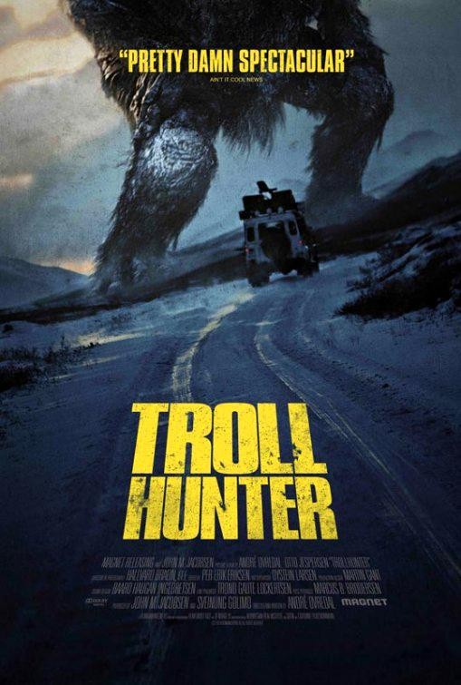
Movie Review: Troll Hunter (2010)

Cast: Otto Jespersen, Glenn Erland Tosterud, Johanna Mørck, Tomas Alf Larsen, Hans Morten Hansen ~ Writer: André Øvredal ~ Director: André Øvredal

Troll Hunter Movie Poster 2010 Trolljegeren[xrr rating=4/5]

Reviewer: Jehan Ranasinghe (aka @Maustallica)

The Low-Down: A triumph of filmmaking imagination on a shoestring budget, Troll Hunter may not be the deepest film in the world, but it displays more than enough creativity, craft and audacity to be a thoroughly entertaining romp.

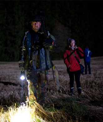
What’s it About?: This “true” story alleges to be the recovered footage of a trio of Norwegian university students making a documentary about a man they suspect to be an illegal bear trapper. When they catch up to the presumed poacher, Hans (Otto Jespersen), they discover instead that he’s a professional troll hunter, tasked with keeping populations of the mythological creatures in check for the Norwegian government. Hans decides to allow the students to accompany him on his excursions and document his work – a decision that threatens to make their university film project rather more hazardous than they realise…

The Story: It’s been curious watching the development of the “found footage” filmmaking subgenre in the last decade or so. It was always inevitable after the phenomenal success of The Blair Witch Project that imitators would spring up in its wake, but it’s nevertheless been surprising just how mainstream this once revolutionary filmmaking style has become. From indie efforts like [REC] and Paranormal Activity to blockbusters such as Cloverfield, directors have been queuing up to embrace documentary-style concepts such as the shaky viewpoint, improvisational dialogue and to-camera monologues, rendering these ideas – groundbreaking in 1999 – as conventional and familiar as a fake-out scare or musical sting. This isn’t to say that all found footage movies post-Blair Witch have been worthless (though the quality has certainly been variable), but it can sometimes be difficult to recall exactly what made this genre seem so interesting in the first place.

Troll Hunter Movie Still 2010 Trolljegeren Otto JespersenThis is one of many reasons why writer/director André Øvredal’s Troll Hunter – originally released in its native Norway in 2010, but only now receiving its general UK cinema release – comes across as such a breath of fresh air. A gutsy, good-natured and endlessly creative work that works near-miracles with a tight budget, this is a film that evokes the Blair Witch spirit in all the right ways – and not just because it features long stretches of two guys and a girl running for their lives through a dark forest. Rather, it calls back to the same ideal of making something out of nothing and allowing the boundaries of low-cost filmmaking to act as a guide rather than a limitation, resulting in a movie with a delightfully homemade feel to accompany its pleasingly robust credentials as a cinematic thrill-ride.

One of the first things you’ll notice about Troll Hunter is this: it is exceptionally Norwegian. From its endless shots of wild, haunted landscapes to its constant references to local cultural trends, both ancient and modern, every part of the film’s identity is inextricably tied up with that of its home country. Of course, a Scandinavian flavour is no obstacle to international success these days, thanks to films such as Let the Right One In and The Girl with the Dragon Tattoo, but one does sometimes feel in the case of Troll Hunter that it’d probably be impossible to ever fully understand its full range of allusions without actually being Norwegian, or at least coming armed with a list of annotations.

But that matters little when the lore within the film that does translate does so with such effectiveness, most notably in the case of the trolls themselves. To create his creatures, Øvredal comprehensively raids the store of fairy and folk tale conventions, selecting and discarding iconic traits with equal glee. There’s no riddle-solving or fee-fi-fo-fumming involved with these trolls, concepts pooh-poohed as silly children’s stories by the characters; conversely, tropes such as bridge-dwelling, turning to stone in sunlight and sniffing out the blood of Christians are retained, rationalised with cheerfully pseudoscientific explanations and utilised as the basis for tense action set pieces. Øvredal shows equal opportunistic skill in turning contemporary Norwegian cultural touchstones to his film’s advantage – illegal bear hunting becomes a cover for the troll hunter’s activities and the country’s enormous power pylons become anti-troll defence systems, while a clip of Norway’s prime minister Jens Stoltenberg is amusingly deployed as an off-kilter punchline.

Troll Hunter Movie Still 2010 Trolljegeren Otto JespersenThroughout Troll Hunter flows the likeable sense of a team cobbling together the best film they can with the materials they have to hand, Blue Peter-style. This extends through to its cast, an amiable collection of young unknowns and Norwegian comedians who generally don’t excel, but nevertheless fulfil their roles more than adequately. The clear standout is Jespersen, the titular troll hunter himself, who makes for a compellingly gruff presence as he portrays Hans as a jaded civil servant who’s sick of years of low-paid, underappreciated work and filling in “slayed troll forms”. However, the most remarkable use of resources comes in terms of the film’s visual effects, which utilise a variety of intelligent techniques – smart lighting, evocative camera work, economical use of effects shots – to make a budget of $4 million go much further than you’d think possible. Granted, some of this is accomplished through misdirection, with rapid cuts tricking the brain into thinking it’s seen more than it really has, but you’d be churlish to complain about corner-cutting when the film reveals the Jotnar, its colossal 200-foot showpiece monster, which wouldn’t look out of place in a film with ten times the resources.

Troll Hunter Movie Still 2010 TrolljegerenIn fact, if there’s any major problem with Troll Hunter, it’s that its skill with individual elements of filmmaking technique sometimes exceeds the quality of the film itself. For all the ambition showed in its production, the final work is exceedingly simple, often to a fault; once the initial thrill of being introduced to the trolls has passed, it becomes clear that there isn’t a huge amount more than that going on, with light elements of satire about the oppressive Norwegian government playing second or third fiddle to enjoyable but shallow troll-battling thrills. Beyond the deliberately distant and enigmatic Hans, there also isn’t much in the way of character interest; the central trio don’t really get much development, with dramatic, tragic developments for the group being brushed off with disconcertingly little fanfare. One does feel that the film – with its desolate backdrops and its strangely sad, subdued monsters and protagonists – probably could have afforded to explore its melancholic overtones more deeply had it so chosen; that it doesn’t is a cause for slight disappointment.

Still, when a film gets as much right as Troll Hunter does, it’s exceedingly difficult to wish it anything other than success. It certainly deserves to make back its modest budget and achieve cult status, both inevitabilities once its English-language run is complete; it’ll also be interesting to watch the progress of the equally inevitable US remake, options for which have reportedly already been picked up by Chris Columbus’ production company 1492. Certainly, it’s hard to see how well this would work outside its Norwegian setting, or if its low-rent charms would translate across to a higher-budget production, but none of that should concern Øvredal and crew; however well or badly the remake fares, it shouldn’t take away from the success of their idiosyncratic and hugely charming effort.

The Verdict: It’s not big and it’s not massively clever, but Troll Hunter is everything you want from a cult creature feature; ingeniously made, blackly humorous and full of well-crafted thrills.

Movie Review: Harry Potter and the Deathly Hallows – Part 2 (2011)

Cast: Daniel Radcliffe, Emma Watson, Rupert Grint, Ralph Fiennes, Alan Rickman, Michael Gambon  ~ Writer: Steve Kloves ~ Director: David Yates

Harry Potter and the Deathly Hallows Part 2 Movie Poster 2011 Daniel Radcliffe Rupert Grint Emma Watson[xrr rating=4.5/5]

Reviewer: Jehan Ranasinghe (aka @Maustallica)

The Low-Down: The lavish finale to one of the biggest franchises of recent times, Harry Potter and the Deathly Hallows – Part 2 plays with massive stakes and wins big, delivering a fine ending to the Deathly Hallows story and an emotional send-off for the Potter franchise as a whole, as well as being a superbly made film in its own right.

What’s it About?: Things are looking bleak for teenage wizard Harry Potter (Daniel Radcliffe) and his friends: the evil Lord Voldemort (Ralph Fiennes) has acquired the most powerful wand ever to exist and the forces of darkness are closing in. Harry’s only option is to complete his task of locating and destroying the Horcruxes, magical artefacts protecting the Dark Lord’s soul: a mission that will involve a daring bank heist, deadly duels and an all-out war on the grounds of Hogwarts School of Witchcraft and Wizardry, culminating in a final conflict with Voldemort himself. It all ends here…

The Story: (WARNING: No story details in this review will come as a surprise to fans of the book, but anyone who’s managed to stay unspoiled for the last four years may want to tread carefully…)

Let’s make no mistake here: Harry Potter and the Deathly Hallows – Part 2 is a Big Deal.

A lot of films get branded as “event movies” these days; generally, it’s little more than marketing rhetoric, designed to add unwarranted cultural justification to the latest identikit special-effects showcase. Naturally, Warner Bros has been hyping David Yates’ film to the rafters as well, but in this case, its reputation would have preceded it anyway. It’s the direct follow-up to one of 2010’s most successful movies and an adaptation of the fastest-selling novel of all time. It’s also the finale to a cross-media franchise that has produced the highest-grossing film series of all time, one that has been gradually building to this point of payoff for the last decade. It all comes down to this.

Harry Potter and the Deathly Hallows Part 2 Movie Poster 2011 Daniel RadcliffeNo pressure then, Mr Yates? Judging from the finished product, the answer seems to have been: no, not really. The weight of expectation may have been high, but brush away the hype and you find that Deathly Hallows Part 2 is rock-solid enough to withstand it all. A surprisingly different beast from the quietly excellent Deathly Hallows Part 1, the final Potter is a splendidly-mounted production that knows just how to wrangle its sprawling, challenging source material into something manageable, blending complex lore and grand spectacle with sincere emotion and sombre reflection. It’s reverential enough to please the diehards, while being broad and entertaining enough to convince as a genuine cross-demographic crowd-pleaser. Yates is juggling with an unprecedented number of balls here, yet manages to keep almost all of them in the air, in a way that rarely feels like a great strain.

It could have all turned out so different. I’ll admit to having been hugely sceptical when Warner Bros announced in 2009 their plans to divide JK Rowling’s final Potter tome into two parts, a decision I feared had been made for all the wrong reasons. After all, previous films had done a terrific job of condensing breezeblock-sized tomes such as Goblet of Fire and Order of the Phoenix to manageable lengths; opting against taking the pruning shears to the (admittedly far denser) Deathly Hallows could have ended up as a creative and commercial indulgence, a formless maelstrom of needlessly-included material and meandering pacing. Indeed, such criticisms were aimed by a minority of critics at last year’s Deathly Hallows Part 1, but seeing both halves of the story goes a long way to dismissing these concerns. Part 1 was an equally handsome, well-executed production, but it was burdened by the majority of the book’s expositional heavy lifting and slower, uncinematic passages; as a result of its predecessor’s work, Part 2 is able to give a proper account of the truly climactic and conclusive elements of the story, which are delivered with enough scale, gravitas and forward impetus as to make the entire split feel justified.

Harry Potter and the Deathly Hallows Part 2 Daniel Radcliffe Emma Watson Rupert GrintAdmittedly, there are hiccups along the way. As a film that’s exclusively interested in endings, it’s perhaps predictable that it has trouble finding a way to start, throwing the audience right into the momentum stream of the previous instalment’s finale in a way that’s somewhat disorienting. Deathly Hallows 2 is weakest in an opening half-hour that really doesn’t fit any conventional ideas of a “beginning”; the Gringotts bank raid sequence, though wonderfully realised, has the feel of a loose end from Part 1, while the subsequent meeting with Aberforth Dumbledore (Ciaran Hinds) comes across as a vestigial element from the book, condensing Rowling’s revelations about the hidden past of Michael Gambon’s Albus Dumbledore to the point of inconsequentiality.

Yet once the action returns to Hogwarts in preparation for the all-out war that closes the novel, the film finds its climactic identity, drawing in iconography from the preceding seven films to create lines of symmetry extending through the entire series. The opening Chris Columbus-helmed Potter entries don’t always get a lot of credit, but they did a fairly stellar job of creating a solid architecture within which the more adventurous later films could safely experiment; Deathly Hallows Part 2 clearly recognises this, and spends much of its running time nostalgically venerating that architecture or cathartically dismantling it. The epic good-vs-evil conflict represented by the Battle of Hogwarts is grand enough on its own, but by setting these events against a backdrop of familiar locations such as the Great Hall and the Quidditch stadium falling to ruin, the film is given an easy shorthand method of evoking the end of an era, one that it does not waste. Credit must also go to Alexandre Desplat, returning to scoring duties from Part 1, who makes the sensible decision this time to complement his own accomplished compositions with some of John Williams’ most iconic melodies, restoring a musical consistency to the series that had been on the wane.

Harry Potter and the Deathly Hallows Part-2 PhotoOf course, there’s more to this series’ lore than castles and chord progression, and while it can’t be said that Yates makes maximum use of the human players in the Harry Potter legend, it’s arguable that he doesn’t need to. After all, Potter is uniquely able to demand anything it requires from the cream of British acting talent – even if “anything” means “nothing” in many cases. Heavyweights such as Gary Oldman, John Hurt, Emma Thompson and Miriam Margolyes are essentially reduced to roles as glorified extras, present only to serve the series’ overall continuity, though the adult cast retains some standouts: notably Alan Rickman, whose Professor Snape delivers one of the most emotionally important moments of the series, and Ralph Fiennes, cutting loose as a Voldemort who becomes tangibly more volatile as his immortal power gradually ebbs away. However, the true lynchpins of Deathly Hallows Part 2 cast are its youngest members, vindicating the remarkable gamble of founding its entire future success of the franchise on the development of a gang of unknown pre-teen actors. Complaints can always be made, but seeing the way Emma Watson, Rupert Grint, Matthew Lewis and especially Daniel Radcliffe have come to occupy and embody Rowling’s characters, it’s hard to see how the choices made back in 2001 could have been paid off significantly better.

Harry Potter and the Deathly Hallows Part 2 Daniel RadcliffeIn the final reckoning, and once the surprisingly effective epilogue scene has faded away, it’s this pleasing correlation between risk and reward that resonates most strongly. The Harry Potter films could have easily ended up as a creatively compromised series of cash-ins; instead, Warner Bros utilised the power of the brand to mount an unprecedented experiment in serialised cinematic narrative, hiring the industry’s best talent to tell a seven-year story in (more or less) real time, while betting millions of dollars on untested children and the outcome of a story that they didn’t even know the ending to when they committed to the project. In an increasingly sterile, risk-averse Hollywood environment, that’s a hell of a bet to make; as critical plaudits and record box-office takings roll in for Deathly Hallows Part 2, it can be concluded that it’s paid off handsomely. Whether we’ll ever see anything like it again is unclear; whether this model could ever produce the same success of Potter is unlikely. The long-term legacy of the Harry Potter movies will only become clear in the coming decades; for now, it’s just worth enjoying the end of a not-always smooth but ultimately satisfying ride.

The Verdict: It’s not easy to bring closure to ten years of swirling plotlines and weighty expectations to a close, but Harry Potter and the Deathly Hallows – Part 2 pulls it off with a minimum of fuss, delivering a satisfying adaptation of a challenging book and hitting all of its climactic marks, while skimping on none of the humour and heart that’s given the series its spark.

[amtap amazon:asin=B0051CBWEU]

[amtap book:isbn=1408810298]

Comic Review: Locke and Key – Keys to the Kingdom

Writer: Joe Hill ~ Artist: Gabriel Rodriguez ~ Colours: Jay Fotos ~
Publisher: IDW ~ Year: 2011

Locke and Key Volume 4 Keys to the Kingdom Joe Hill Gabriel Rodriguez IDW Comics[xrr rating=5/5]

The Low-Down: The fourth collection of Joe Hill and Gabriel Rodriguez’s dark fantasy is the best yet – a pitch-perfect example of horror storytelling combined with inventive concepts, brilliant characterisation and yet more jaw-dropping artwork.

What’s it About?: Their father was murdered, and the Locke children have returned with their mother to the old family home of Keyhouse. There, they’ve discovered a whole collection of magical keys with bizarre and unearthly powers – and they’ve also come under threat from the creature that used to be trapped in the Keyhouse well. Unfortunately, they don’t know that the creature is now posing as their school friend Zack Wells, who’s starting to lose patience in his quest to find the mysterious Omega Key…

The Story: Ah, expectations can be a killer. Tell a longtime comics fan that his favourite series’ next six-issue outing will consist of four one-part stories and a two-parter, and disappointment will almost immediately set in. Modern-day mainstream comics (especially superhero stories) often seem structured more as six monthly chunks of the final graphic novel than instalments in their own right, and often don’t even work on their own terms as a single instalment. Single issue stories – they’re supposed to be the exception, not the rule. Aren’t they?

However, Locke and Key is a different matter. Ever since volume 2, Head Games, the series has placed just as much emphasis on the character-centric single issue stories as on the bigger, pacier tales (like the three-part Crown of Shadows adventure in volume 3), and while volume 4 does mainly consist of character-driven single done-in-one stories, this is a long way from being filler – in fact, it’s the most inventive and adventurous collection of Locke and Key to date, advancing the story in a number of critical ways, giving us a whole selection of new keys, all while building up to a shocking climax and a mother of a cliffhanger.

Locke and Key Volume 4 Keys to the Kingdom Joe Hill Gabriel Rodriguez IDW Comics Issue 3 Cover 'February'A tremendously skilled writer, Hill continues to serve up outstanding characterisation, adding nuances to character with carefully chosen details, and paying off emotional plotlines with massively affecting consequences. Of course, to anyone who’s read his fiction this is no surprise (Hill’s second novel, Horns, remains the only novel I’ve ever given up on part-way through simply because I knew it was going to upset me too much), but one of the most impressive things about Locke and Key is that, unlike some novelists who end up writing comics (and who often end up producing fine work), Hill really does understand how comics work as a medium, and that they let you do things you simply can’t do anywhere else.

There are points in Keys to the Kingdom where Hill cuts loose with a more daring and experimental approach (from the brilliantly compressed storytelling of ‘February’ to the wonderful and utterly unexpected Calvin and Hobbes homage in ‘Sparrow’), all the while understanding when to let the visuals tell the story. Locke and Key is a comic with a really distinctive identity, and the tonal shifts between off-beat dark children’s fantasy and outright horror just get more and more effective and disturbing. Indeed, it’s incredible exactly how much plot Hill manages to cram into these six issues, while he also gradually cranks the tension up to almost unbearable levels and shows no compunction in going for genuinely horrific violence when it’s required.

Hill’s already declared that Locke and Key will be ending in twelve issues, and the first issue of the fifth miniseries ‘Clockworks’ will be appearing in comic book stores soon – but while the story may be heading towards it’s end, it’s obvious there are plenty of shocks and surprises to come. The long-awaited TV adaptation may have failed to get beyond its unaired (and highly acclaimed) pilot episode, but Locke and Key remains one of the most well-crafted and compulsively readable comic books currently being released.

Locke and Key Volume 4 Keys to the Kingdom Joe Hill Gabriel Rodriguez IDW Comics Issue 2 Incentive Cover 'White'The Art: He started strong, and has been getting better and better through every series, but Keys to the Kingdom sees Gabriel Rodriguez go even further than before. His controlled, cartoony yet distinctive style is still as sharp as ever, as is his design work (virtually every one of the Keyhouse keys is a genuine work of art), but here he also takes on some serious challenges, whether it’s the brilliant war comic homages in chapter four, or the daring and wonderful Bill Watterson homage in chapter 1. Each one of these he pulls off with a major amount of style, while also matching Hill’s script in terms of portraying the character’s emotions (especially in the wonderful third chapter). Combined with Jay Fotos’ gorgeously creative and subtle colour work, and Locke and Key remains a seriously good-looking bit of comic art.

The Verdict: If you like dark fantasy or horror, and you’re not reading Locke and Key, get a move on and catch up with the story so far – you won’t be disappointed. One of the best comic series currently being published is going from strength to strength, and looks to be powering its way towards one hell of an ending.

[amtap book:isbn=1600108865]

TV News: Preludes and Nocturnes (Or, the Disappearing and Reappearing TV Adaptation of The Sandman)

Sandman Neil Gaiman Dave McKean TV Adaptation News

Scarcely have I stopped talking about how happy I am that the mo-cap Yellow Submarine remake isn’t happening, when another project that I’m slightly concerned about starts hovering in the Schrodinger’s Box of Cancelled/Not Cancelled reality. In this case, it’s the potential TV adaptation of one of the most successful and well-known graphic novels of all time – Neil Gaiman’s The Sandman.

Sandman Neil Gaiman Dave McKean TV Adaptation News Cover ArtA 75-issue series that started out as a top-down remix of an old DC Comics character and went on to redefine much of what you could do in comic books, all while delivering stories that were dark, melancholy, funny, twisted and utterly distinctive, The Sandman is a hell of a comic book. One of the most high profile successes in the comic industry over the last twenty five years, Hollywood has been circling it for a very long time – but the distinctive style of The Sandman is also the thing that makes it incredibly hard to adapt. Neil Gaiman’s Sandman stories are lyrical and odd in construction, often using fairy tale logic or confounding the reader with deliberately anti-climactic endings, while the protagonist,  the moody and aloof immortal being known as Morpheus, the Lord of Dreams, is often more of a background presence. There are very few genuine villains in The Sandman’s world, and even the ones that are there don’t function the way you expect them to (or don’t actually receive any come-uppance), and the whole thing is about as far from Hollywood storytelling as it’s possible to get.

Sandman Neil Gaiman Sam Kieth TV Adaptation News ArtThere have been attempts since the early Nineties, but none have ever come to fruition – Roger Avary, Gaiman’s collaborator on Beowulf, came closest to managing a fairly faithful adaptation, but even his attempt eventually floundered, and ever since it’s seemed that there’d never be a way of reconciling The Sandman’s deliberately offbeat storytelling with the money it would take to actually make.

Then, in the middle of last year, rumours of a TV series started to circulate. Given The Sandman’s deliberately long-form storytelling structure, a TV adaptation isn’t an insane idea, and would certainly give the concept much more room to breathe. Plus, there’s much more potential to acheive something closer to the comic’s unique flavour on TV, rather than trying to do such a kooky story in the increasingly homogenised world of Hollywood Blockbusters. In an ideal world, a Sandman series developed by someone like HBO would be ideal – the original comic wasn’t afraid to go in some very dark, graphic and adult directions, and a series that was just as free to explore that kind of territory (along the lines of the recent AMC TV adaptation of The Walking Dead) could be a genuinely promising prospect.

Unfortunately, it seemed that Warner Bros were actually hoping for a replacement for their absurdly long-in-the-tooth ‘Young Superman’ series Smallville, and the Producer who was possibly going to transfer Gaiman’s work to the small screen was Eric Kripke, the creator of long-running fantasy/horror show Supernatural. This didn’t fill me with confidence – I’ve only seen one episode of Supernatural (and that was a long time ago) so I can’t judge Kripke’s suitability or not, but the idea of aiming The Sandman at mainstream network TV seemed, well, odd to say the least. It’s not impossible that such a project could work, but the potential for massive compromises and creative disaster was pretty damn strong, and it went down as something that I wouldn’t be upset about if, as with so much in the long history of proposed Sandman adaptations, it came to nothing.

Sandman Neil Gaiman Marc Hempel The Endless TV Adaptation News ArtSo, when I woke up this morning to find the internets ablaze with the announcement that Kripke had announced that it didn’t look like The Sandman was happening “at least for this TV season”, I have to admit I breathed a small sigh of relief. A TV version of The Sandman would be massively risky, and I’d far rather see it not happen than for a watered down, diluted version to shuffle its way onto the screen. The Sandman does strike me as one of those stories that, like Watchmen (despite all of Zack Snyder’s efforts) works best as a comic – its structure, its weirdness and its limitless imagination is simply ideal for the comics medium, and crowbarring it into another form risks breaking what makes it special in the first place.

However, it looks like I spoke too soon. DC’s Creative Chief Officer and Head Writing honcho Geoff Johns went on Twitter today, and tweeted: “Correction to world: The Sandman is AWAKE! Psyched to be working with @neilhimself on developing one of the greatest series ever!” It’s especially interesting, considering that according to Kripke, he had talked to Gaiman (aka @neilhimself) about the project, but wasn’t actually working directly with him. Of course, this could be general PR just to prevent people mistakenly thinking the project was actually dead, but for the moment it looks like the project is certainly active. Which means I get to keep being mildly concerned. Oh, hooray…

Of course, one interesting factor is whether or not a similar project makes it to the screen. Joe Hill’s brilliant dark fantasy comic book Locke and Key has been developed into a TV series – a pilot episode has been shot (directed by music video supremo and Never Let Me Go helmer Mark Romanek), and if it gets the green light, it’ll be going to a full series for the September 2011 TV season. If a project as dark and interesting as Locke and Key gets onto TV screens still with its weirdness and character intact, then I’d say the possibility of getting a Sandman TV series will definitely go up – but I’ll still remain to be convinced that this isn’t going to be anything other than yet another disappointing comics adaptation…

Comics Review – Locke and Key : Welcome to Lovecraft

Writer: Joe Hill ~ Art: Gabriel Rodriguez ~ Colours: Jay Fotos
Publisher: IDW ~ Year: 2008

Locke and Key - Welcome to Lovecraft Gabriel Rodriguez

[xrr rating=5/5]

The Low-Down: The first volume of a major work of dark fantasy from the acclaimed author of Heart-Shaped Box, this is a gripping and superbly crafted comic book (currently being adapted for US television) that will have you genuinely gripped and hungry for more.

What’s it About?: Their father has been brutally murdered. Now, the Locke children and their mother are living in the old family home outside the town of Lovecraft, and trying to piece their lives back together. Problem is, their house has secrets. There are the keys that open doors in weird and magical ways – turning you into a ghost, letting you go anywhere, and many, many others. And there’s monstrous evil lurking in the shadows, waiting for the chance to find the key to the Black Door…

The Story: A piece of advice – if you’re ever looking for a place in the country to recuperate after a devastating personal loss, don’t even think of moving to somewhere called Lovecraft. Of course, the characters in this opening instalment to the dark fantasy saga Locke and Key don’t know their 1930s pulp horror authors, leading to a whole heap of trouble and one of the most distinctive comics of recent years.

What’s most surprising about Locke and Key – especially in this opening six-issue arc – is how it takes incredibly familiar fantasy/horror tropes and makes them feel fresh, new and accessible. Scriptwriter Joe Hill (author of horror novels Heart-Shaped Box and Horns, and also son of Stephen King) isn’t afraid to use a very traditional setup to tell what turns out as a surprisingly characterful and layered story. Locke and Key is, in many ways, a typical kids adventure story filtered through a brutal, adult perspective – there’s magic and weirdness to be discovered, but at a cost that’s traumatic, often bloody and leaves a difficult aftermath in its wake. The Locke kids each have to deal with their loss in different ways, and the story is just as much about them gradually coming to terms with their father’s death as it is about magically empowered keys. Hill’s characterisation work here is exceptional, giving every character depth and layers, making us care for them while slowly ratcheting the suspense up as the story marches inevitably towards a tense and violent conclusion.

Locke and Key page art - Gabriel RodriguezIt also helps that he’s got a great understanding of how comic storytelling works. Writers best known in other mediums don’t always get comic books, and will often make them over-wordy or rely too much on narrative caption boxes for comfort, but Hill gets the pacing and rhythm of the story exactly right, and also knows the kind of tricks you can pull off with the comics medium – creative flashbacks, juxtaposing scenes, and manipulating time in a number of creative ways. He’s able to be inventive, while keeping the drive of the story going, and the end result is a collection that’s extremely hard not to power through in one sitting.

This isn’t the full story, of course. Welcome to Lovecraft is a scene-setter, a suspenseful curtain-raiser for the slightly more slow-burning but still brilliantly crafted main event, the long-form story that continues through the following volumes Head Games, Crown of Shadows, and Keys to the Kingdom (still being published in issue format). Hill has a big story to tell, and he’s willing to take his time – there are only hints of the bigger picture here, but they’re all intriguing enough to almost guarantee you’ll be hooked by the end of this story. Horror comics very rarely manage to be genuinely scary, but Locke and Key pulls it off thanks to brilliant characterisation, sharp storytelling, and a writer who knows exactly what he’s doing.

Locke and Key - issue cover - Gabriel RodriguezThe Art: Plus, there’s the simply awesome artwork from Gabriel Rodriguez. Showcasing a stunning level of design and detail, Rodriguez has a really interesting visual style that’s almost like a cross between Frank Quitely and Richard Corben, cartoony yet rooted in a very firm and physical sense of realism. The nuances and body language of the characters are all incredibly well portrayed, while he also throws himself into the darker, more horrific material with serious gusto. From full-page splashes to some eerie dream sequences this is great, atmospheric stuff that’s fully supported by some artful and delicate colour work from Jay Fotos. It’s massively impressive, attention-grabbing work – and, amazingly, in comparison to his work on the later volumes, this is just the warm-up act…

The Verdict: An enthralling mix of dark fantasy and horror, this is a characterful and gripping piece of comic-book storytelling that will have you instantly hooked. Yes, there’s a US TV adaptation in the works, but do yourself a favour and get reading the original as soon as is possible.

[amtap book:isbn=1600103847]